A little more on Gestalt

March 24, 2010

A dictionary definition of Gestalt — A physical, biological, psychological, or symbolic configuration or pattern of elements so unified as a whole that its properties cannot be derived from a simple summation of its parts (http://dictionary.reference.com/browse/gestalt).

A design-related definition of Gestalt — Gestalt psychology attempts to understand psychological phenomena by viewing them as organized and structured wholes rather than the sum of their constituent parts (http://www.interaction-design.org.)

Psychologically, Gestalt laws or principles explain how we form perceptions with the help of past experiences. Therefore, what we perceive can be different from reality and can change from person to person. In summary “The whole is greater than the sum of the parts”

Gestalt principles include: Similarity, Continuation, Closure, Proximity, and Figure and Ground. I drew up some samples of figure and ground and closure to share with you.

Cat looking at you or two unicorns having a face off?

Figure/Ground – 6 hearts and 3 baby elephants

Gestalt in "closure" looks like a ski or race car brand

I am an Artist…no really…no really

March 24, 2010

My class assignment is to create a personal aesthetic statement for myself. At this point in my life, I am inclined to write, “I am an artist.” When I was in college my first time around it was “At a later date, I’ll be awful great.” well, it is a later date…and nothing really came of that. Time for change.

Something I find peculiar about being in the graphic design industry is that people don’t view graphic design the same way they do “Art.” For example, when our class gives critiques on student projects, if it is a sculpture or a Photoshop drawing or painting it is viewed more “personal” and it can’t really be critiqued in the same way as graphic design. One almost feels like if you were to speak up, you would hurt the artist’s feelings.

I have always been able to squint or view art in a way that immediately tells me what could make the project better. I can pick over a painting – or “Art” just as easily as I could a graphic design poster. But we don’t. I guess we assume the artist intended it to be that way. Graphic design on the other hand can be changed to fit the needs of the client and everyone’s a critic. Students in class pick apart the “print design projects” but in reality the art of a Graphic Designer goes beyond what the project “looks like.” It tells a story, it is the art of visualizing and connecting ideas and concepts – so, critique about the margins and colors if you will, but graphic design should go far beyond what looks good. We should be the telling the story of how we came to our design and critique that process as it is the more important aspect of our work.

Graphic design is “Art” and there is good and bad in all art forms. I design different kinds of art for different kinds of clients and in varying shapes, sizes and forms. Connecting ideas is my form of “Art.”

Anyway, all that to say this…my personal aesthetic statement “I am an artist.”

The way I see it

March 24, 2010

In the book, Ways of Seeing, Author John Berger writes his views on the different ways art can be viewed and interpreted and the different things the way we view art can tell us today. The book is based on Bergers views and shows many photographs and paintings illustrating his points sometimes to the point of overkill.

The book covers topics about how even though the art medium has changed, it is still the history of this art that depicts how we both view and create art and design today. Berger writes about original paintings by fine artists and how they were viewed, he then moves on to the sexes, and then to art as a social status. He discusses at length how art and design depicts the sexes. If you would like to read my opinion post on these chapters – see my extra credit blog “being viewed by men, being viewed by women”.

The material in this book was intuitive. I did have an AHA moment as to both why women view themselves as a man would (from seeing it depicted in paintings throughout history), as well as where the ideas of advertising originated (again historically, from viewing paintings of wealthy families). Seeing the truth in Berger’s explanations almost gave me a “duh” gut reaction to much of the material, even though it was not stuff I ever intentionally thought about.

I doubt I will look at art any differently from reading this book. It just reinforced my negative views of society as a whole (my dark side). I came away knowing that I must proactively design in the opposite way of what I see being designed today. I will continue to point out and speak my tiring opinion when I see others falling prey to popular pitfalls.

Cultural Awareness

March 10, 2010

Note: This blog is intended to illustrate the importance of cultural awareness in the graphic design and marketing industry. Please do not take offense.

Cultural awareness is extremely important in the graphic design and marketing industry because it is our job to communicate or convey a message properly. We must be sensitive to other cultures as they may interpret the message in a different way. What is considered appropriate in one culture may be completely inappropriate in another. When working for a company or as a freelance designer, we must have tolerance to diversity and increase both self-awareness as well as cross-culture awareness. Without this awareness, advertisements or campaigns can lead to blunders with damaging consequences. Both the success and failure of your product may rely on cultural awareness.

hmmmmm.

Locum, a Swedish medical company sends out Christmas cards to their customers. In 1991 they decided to give their logo a little holiday spirit by replacing the “o” in Locum with a heart. The result looked something like this and the Christmas card took on an entirely different meaning here in America.

During its 1994 launch campaign, the telecom company Orange had to change its ads in Northern Ireland. “The future’s bright … the future’s Orange.” That campaign is an advertising legend. However, in the North the term Orange suggests the Orange Order. The implied message that the future is bright, the future is Protestant, loyalist… didn’t sit well with the Catholic Irish population.

Crayola has changed color names over time due to the civil rights movement and other social pressures. In 1962, Binney & Smith replaced flesh with peach, in recognition of the wide variety of skin tones. More recently, in 1999, they changed Indian red to chestnut. The color was not named after Native Americans; it was actually named for a special pigment that came from India.

Peace, Victory, Rabbit Ears or “UP YOURS!”

I once designed a cover to a magazine where a photo of a little girl in a parade was giving a high peace sign (also considered a V as in victory). As children often do – the peace sign was backwards, thus her palm was facing herself. An employee came into our office just as the proofs of the cover were ready to go to press and said, “Where I am from (England), that little girl would be saying,  “F*** You, or at the very least, Up Yours.”  We had to quickly rethink whether or not we should use the photo as the cover. In sensitivity to others, we decided to use the photo in a much smaller version inside the magazine, but chose a different shot for the cover of the magazine. This insulting meaning also occurs in many English-speaking countries outside of North America.

In 2002, Umbro, the UK sports brand had to withdraw its new tennis shoe line called the Zyklon (German for Cyclone). The firm received complaints from many organizations and individuals, as it was the name of the gas used by the Nazi regime to murder millions of Jews in concentration camps. The connection of the word Zyklon to the concentration camps could have been found easily by typing the word into the Internet. Had Umbro done their homework on cross-culture awareness, they could have saved both time/money as well as the unnecessary grief of others.

http://news.bbc.co.uk/2/hi/uk_news/2222783.stm

http://www.kwintessential.co.uk/cultural-services

symbol, Icon and Index

March 8, 2010

Signs are necessary for every person to function well within society.  Most signs are taken for granted because they are needed and are always assumed to be there.  Signs can be broken down into three categories: symbols, icons, and indexes.

Symbols are visual representations of, most often, abstract ideas or invisible concepts that don’t have any direct connection to the symbol that represents them.  Symbols’ meanings are often learned through cultures and are not immediately grasped by most individuals.  The meanings are assigned to the symbols by people or cultures where the symbols themselves do not often have those inherent meanings.

Icons are visual representations as well, but, unlike symbols, they represent ideas, physical processes, or physical objects directly.  Ranging from people being icons for a category to which they directly relate to small, simple visual pictures that represent a software program, icon meanings are found within their own visual display.

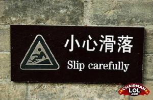
Indexes are visual representations of actions or complex messages that need to be expressed in a very simple way in order to be easily understood at a quick glance.  Like roadway signs and the cautionary signs seen in front of parks, indexes directly illustrate a message to the viewer to take some kind of action.

3 symbol examples from Kristi, Nick and Duncan (respectively):


3 Icon examples from Kristi, Nick and Duncan (respectively):

3 index examples from Kristi, Nick and Duncan (respectively):

My examples of Symbol, Icon and Index (respectively):

Sources:

http://www.templeterrace.com/police/images/TrafficSignalSign.jpg

http://www.clker.com/cliparts/d/4/d/9/1237562201214390563pitr_Coffee_cup_icon.svg.hi.png

http://apps.co.marion.or.us/imagegallery/Recycling%20Images/photogallery/Radioactive%20Symbol_RGB.jpg

http://djkonservo.files.wordpress.com/2008/08/all_seeing_eye.jpg

http://www.freewebs.com/truesocialism/Communist%20Symbol.png

Rolling Stones logo: John Pasche, Graphic Designer

http://lifesavingfoundation.com.au/inc/images/shark_sign.jpg

http://ares.chairmanlol.com/content/543/resized/engrish-funny-1221804809-16526.jpg

Phone: http://www.clker.com/clipart-40845.html

being viewed by men, being viewed by women

February 25, 2010

The Ways of Seeing by John Berger, chapters 2 and 3.

“Men are not born to objectify women, it is a learned behavior, primarily from images of passive women.”

I will try not to let the authors preoccupation with over-representation of nude women prevent me from understanding the message of the chapters. It was written in the 1970’s, and his view must have been extremely insightful, almost feministic in approach. Unfortunately Berger fell prey to the very same issue he discusses and went about making his point in the wrong way.

Berger started off by citing a biblical passage of Adam and Eve as told in Genesis as “believed truth.” The author asks, “What is striking about this story?” his answer is that the woman is blamed and punished for eating the apple by being made subservient to the man. I find NOTHING striking about this biblical story as was written and approved by men. What I find striking about this chapter is that the story is placed in it as truth and once again, points out in an unassuming way, that women are inferior to men.

The author has chosen to explain to us, that women are not only seen as objects by men, but now by themselves. And that this “unequal relationship is so deeply embedded in our culture today.”  What men have done to women, women now do to themselves. They fact that women survey their own femininity is a sad reality that most women already know. We do not need to study another book that chooses to place 27 nude women depicted as objects to point this out –society knows this is an issue, and it needs to stop.

The author points out that naked and nude are two separate ideas. Naked is being by ones self and naked, without being viewed as an object. Nude is being viewed as an object of sexuality or pleasure. The nude paintings shown were specifically for men to view as pleasure images. Men could look at beautiful nudes and gain reassurance of their manhood. As usual, in return the female gets nothing, although the painting seems to be about her, it is not. The artist does everything in his power to remove any power she may have. The painting is all about the owner or viewer, the man. The artist may use a mirror for the nude to gaze into, so she views herself. The mirror is a symbol of vanity, now making the woman vain. Berger points out the hypocrisy of this idea, the woman is vain because she is viewing her self, but the painting is made for the man to view her.

The chapter could have easily relied on Bergers excellent insightful views and perhaps four or five examples of female nudes to prove his point. Berger explained his theory in several paragraphs but chose instead to show us over 27 paintings or photos of naked or nude women. This tells me that the author liked doing the research on this chapter and has continued with the tradition of objectifying women in the name of research, of course.

Women and sex are used profusely in advertisement since it appeals to both women and men. Men want the women and the sex and the women want to be the women the men want. This idea of women and sex ties into the beginning of the book where the women in the advertisements are used for the exact purpose that the female nude was used in traditional oil paintings.

Today, in design, this trend has gone too far. Design has gone beyond “sex sells” to an absolute all-time low – it has moved on to paper-thin models and often-times barely teenage girls. Men no longer have the power they once had over women. But the power men continue to have over women is physical strength and we as a society have come to believe that we must now place physical violence against women in our advertisements to gain viewers attention. Both men and women need to stop the violent depiction of women in art and culture.

What’s that you say…? This woman is coo coo for cocopuffs? Check out these ads for womens clothing and perfume. I would not want to be the women (or the men for that matter) in these situations.

Design Research

February 25, 2010

Cross Tensions/Bridging Devices

Team E: Kristi, Sylvia, Duncan, Nick

Our subjects for this little in-class research project were Cross Tensions and Bridging Devices.  The definitions for these terms were a bit difficult to nail down during our library research but, by looking at various images in books and on the internet, we were able to piece together a rough estimation of what each of them means.

Cross tensions could have multiple definitions.
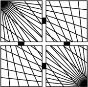
  • Criss-crossing or interweaving lines causing tension in an image.  More specifically, a series of horizontal lines with strong, interrupting vertical lines overlapping them.
  • Architectural design element using criss-crossing beams as designs

One example is as follows: (from Design Basics)

Cross tension is an element utilized in design to create, well, tension.  Under normal circumstances, horizontal lines imply stability, while vertical lines imply strength.  When overlapped in such a jarring fashion, or tilted to form crossing diagonal lines, tension is naturally created.

Here are some examples of Cross Tension in art/print:

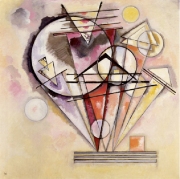
On Points — Wassily Kandinsky

http://web.guggenheim.org/exhibitions/exhibition_pages/kandinsky/index.html

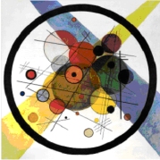
Circles in a Circle – Wassily Kandinsky
http://www.art.com/products/p10329573-sa-i775354/wassily-kandinsky-circles-in-circle.htm


Red In the Net — Wassily Kandinsky
ARTStor

Suprematism — Kazimir Malevich
ARTStor

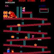
Video Game Example:  Donkey Kong

Nicks Cross Tension Example

Kristi Walker’s Cross Tension Example

Next up we have Bridging Devices.  They can be roughly defined as:

  • An element used in painting or design to bridge an idea or theme
  • A horizontal element in an image that connects or bridges multiple vertical elements
  • An element in architecture that bridges two disparate elements of the building/buildings

One example of architecture is this image, which uses crossing arches to bridge two different buildings: (from Design Basics)

And…more Bridging Device examples:

Red Cross on Block Circle— Kazimir Malevich
ARTStor

Suprematism No. 50 — Kazimir Malevich
ARTStor

Sylvia Yu Bridging Device Example (also has Cross Tensions going on here)

Duncan MacMichael Bridging Device Example

Video Game Bridging Device Example:  World of Goo

Sources: Books

  • Design Basics — by David A. Lauer/Stephen Pentak
  • Design Basics — by David A. Lauer
  • Making and Breaking the Grid — by Timothy Samara
  • Principles of Two-Dimensional Design — by Wucius Wong

Websites

Accessibility and the Printed Piece

February 17, 2010

This week I listened to the podcast entitled Web Accessibility for Everyone, where Jeannie Yandel interviewed Wendy Chrisholm. The interview was about accessibility for the disabled and the web. Wendy starts off with a story about how when she was in college, she was asked to tutor a blind student and how that forced her to think creatively to come up with inventive ideas in order to teach her disabled student. It was during this time that Wendy started thinking about how designers/developers could better overcome obstacles for individuals with disabilities especially pertaining to the web. Wendy helped write the universal accessibility guidelines for web developers and in 1999 the WWW adopted the guidelines as an international standard for web design. Wendy concludes the podcast by encouraging designers to include accessibility from the start.

During my career in print design, I have come across accessibility standards such as braille and raised lettering on materials. I have designed many materials for senior citizens, many who are disabled, as well as for health and wellness events held at our local senior center, but I have never actually been formally trained how to design for the disabled. Upon doing some research, I found several web sites that talk about how to design for the visually impaired as well as how to create signage and event materials that are accessible for everyone attending.

•    Easy to read text, San serif fonts such as Helvetica or Arial.
•    Avoid italics, ornate type, all capital letters, and shadowing effects.
•    Size should be 16-18 points (a min. of 12pt for standard docs.).
•    Use plain language in short, concise sentences – keep it simple.
•    Reiterate information for users with memory problems.
•    “Chunk” materials – one idea per paragraph.
•    Use bulleted lists when possible.
•    Use meaningful headings.
•    Left align, avoiding “rivers of white” caused by justification.
•    Include plenty of white space on the page.
•    Make sure to use clear labels and signs.
•     Provide lots of graphics and visuals to accompany the text.
•    Use quality paper which does not show print on the reverse side.
•    Color and contrast – The contrast between the background and the text is a vital factor in legibility. The better the contrast, the more legible the text will be. The size and weight of the type will affect the contrast. Black text on a white background provides the best contrast.

Good standards of print legibility help all readers. Producing information in legible print is neither difficult nor expensive. In general, the rules that apply to good design often apply to designing for the impaired as well. I leave you with a quote about the printing press that perhaps today could be said about the internet. I agree with Wendy, lets just get it right – from the start!

“The coming of the printing press must have seemed as if it would turn the world upside down in the way it spread and, above all, democratized knowledge.”
– James E. Burke

http://www.lighthouse.org/accessibility/design/accessible-print-design/
http://www.astc.org/resource/access/pmlp.htm
http://www.otc-cta.gc.ca/doc.php?did=46&lang=eng
http://www.euroblind.org/fichiersGB/policy.htm#3111

The Laws of Seeing

February 8, 2010

The Laws of Seeing, by Wolfgang Metzger, is a book that he claims is about human nature. The book describes and explains perceptual studies related to our understanding of why we see the way we do. It draws from Gestalt theory, in that the objects we perceive are not the objects themselves, but rather how our brains construct the objects.

The studies Metzger discusses depend on perceptual research that is shared through photographs and drawings. These examples let the reader “visualize” what he is talking about. We can then make our own personal judgment on what he has demonstrated. Most of the examples suggest that the brain needs to organize and provide proof that this process naturally occurs without our involvement.

Metzger explores the Gestalt principles of: Proximity – things that are close to one another are perceived to be more related than things that are further apart; Closure – when viewing a complex arrangement of individual elements, humans tend to first look for a recognizable pattern; Similarity – things that are similar are perceived to be more related than things that are dissimilar; Figure and Ground – elements are perceived as either figures (distinct elements of focus) or ground (the background or landscape on which the figures rest); and Continuation – elements arranged on a line or curve are perceived to be more related. He also discusses topics such as ambiguous figures, hidden forms, camouflage, and shadows and depth.

I particularly enjoyed reading the chapter Laws of Structure in Children. In cases where, visually, the law of continuation determines the percept, with touch, different shapes are perceived because of law of closure. I was fascinated by the developmental states in shape formation as seen in Figure 59 on page 47, where I could imagine feeling the box as it is described and trying to draw what was felt. Now, I imagine that same experience as a 6 -10 year old. In the figure shown above, a child tries to draw the shape he felt, an excellent example of this law at work.

This classic study on visual perception remains a solid base for understanding how we view things and demonstrates how it is extremely important as designers to learn the gestalt principles of perception. The authors’ view is complementary with the book The Ways of Seeing in that both books explain in different ways that the way we see is both psychological as well as physiological.

If you start paying attention to your designs while keeping the thought of the Gestalt principles in mind and apply these insights to your work, you should begin to easily recognize why some designs or layouts work, while others do not. These principles will help take the guesswork out of good design. Knowing this material will help designers distribute their elements on the page better and, when things aren’t working, the designer will be able to understand why and correct it.

Schwindlig Gestalt

February 4, 2010

The phrase “The whole is greater than the sum of the parts” is often used when explaining Gestalt. The Gestalt effect refers to the forming capability of our senses, in respect to the visual recognition of figures and forms instead of merely a collection of simple lines and curves. It is a study in the higher order cognitive processes. Because the visual world is complex, the mind has developed strategies for coping with the confusion. The mind tries to find the simplest solution to a problem. One of the ways it does this is to form groups of items that have certain characteristics in common.

The aspects of gestalt theory that interests designers, are related to gestalt’s investigations of visual perception, and the relationship between the parts and the whole of the visual. In graphic design, the stronger the grouping, the stronger the gestalt. This grouping contributes to the unity in design. Gestalt is a tool available to a designer for creating unity.

The same concepts that form groups can be reversed to ungroup items and make them look unique or stand alone when viewed. That is the basis for creating variety which can add interest to an image. Too much unity and the design can look boring or repetitive, too much variety and it will look chaotic or disconnected. Understanding these gestalt concepts can help a designer control unity and variety. It is hard to find the balance and often I personally create too much unity in my designs and struggle with variety.

The experimental test I was asked to perform on friends concerns how quickly the mind recognizes a shape within groupings. So, the “whole” that we see rather than a group of separate particles. The selected individuals were shown a series of 5 photos and then a series of shapes, in 20 clicks, with each click being a little closer to forming the odd visual of a horse and rider (see results below).

1) Artistic older female: This person recognized the shape on click 14, extremely fast, without having to go on to the second step of showing 5 photos of animals prior to the series of shapes.

2) Engineer older male: This person saw nothing within the shapes in the first series, but was able to view the horse on the last and 20th click.

3) Firefighter (mid 30’s) Male: This person saw the horse and rider on click 18 of the first series.

4) ADHD intelligent young female: This person never saw the horse and rider but did see a happy face.

5) Math/science oriented young male: This person never saw the horse and rider and even after if was pointed out to him, still could not see the horse and thought the test was ridiculous.

In conclusion, I found that what would appear to be left brained individuals, or the individuals with a seemingly higher intelligence found it harder to connect the shapes were no better at seeing the shapes form into something than the others, in fact worse. Only the woman who is in the art industry and more right brained, or “visual” saw the shapes form into something more easily. Although neither of the younger individuals would consider themselves artistic, the horse and rider could not be seen.